How to Make Layered and Gradient Color Plots
Layering translucent inks or plotting overlapping hatches in different colours lets you create colour mixing and gradients no single pen can produce. Here's how.
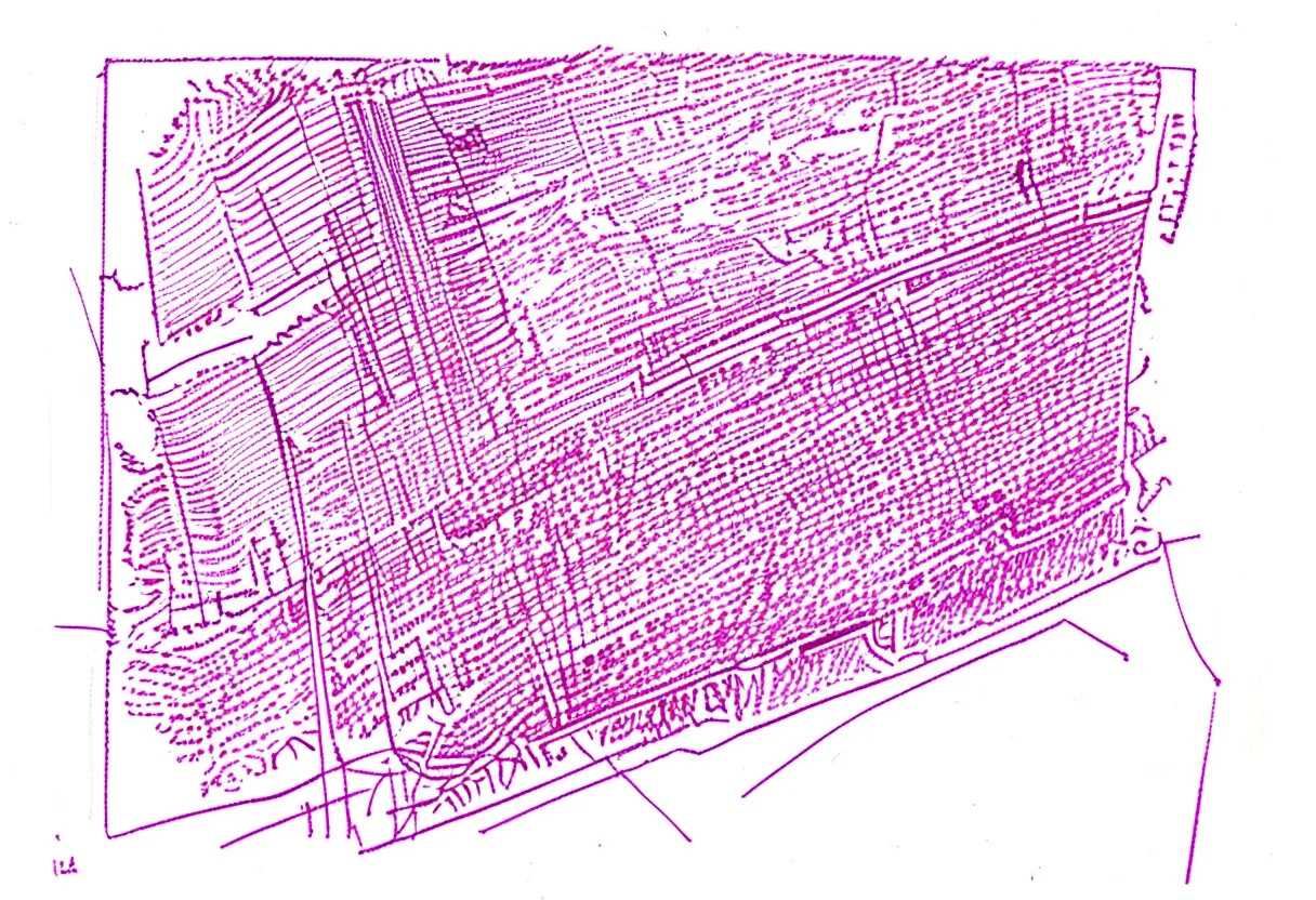
A pen plotter draws one line at a time in a single colour. But a two- or three-layer plot can produce colour transitions, optical mixes, and gradients that look richer than any single pen could achieve. Here’s how layered and gradient plotting works and how to design for it.
How plotters fake gradients
Because a plotter can only make lines, all its “fills” are actually hatching — parallel or cross-hatched lines spaced close enough to read as a tone. The trick for gradients is varying line spacing across a gradient zone:
- Dense lines (close together) → reads as a solid tone
- Wider spaced lines → reads as a lighter tone
- Very sparse lines → reads as near-white
Design your gradient as a region where hatch spacing gradually increases from one end to the other. Any generative design tool can produce this; in Inkscape you can simulate it with progressively spaced lines.
Optical colour mixing with two layers
When you plot a yellow hatch layer, then a blue hatch layer at a different angle over the same area, the eye perceives optical mixing — the overlapping area reads as green. This is the same principle as pointillist painting.
The technique works best with:
- Translucent pigment inks (most fineliners) — they layer and mix; gel inks are more opaque and cover rather than mix
- Angled hatching — 45° and -45° (or 0° and 60°) give good overlap without either layer dominating
- Smooth, lightly sized paper — Fabriano Accademia or Hahnemühle Bristol keeps lines crisp so the mix is defined rather than blurred
Designing a three-zone gradient
A classic exercise: a rectangle transitioning from one colour to another.
-
Design three hatching regions:
- Zone A: yellow-only dense hatch
- Zone B: overlapping yellow + blue hatch (transition zone)
- Zone C: blue-only dense hatch
-
In zone B, gradually increase yellow spacing while decreasing blue spacing across the width — this creates the impression of a smooth gradient even though every line is a pure, flat colour.
-
Plot yellow layer (all of zones A and B’s yellow hatch), then swap pen and plot the blue layer (zones B and C).
The result: a smooth yellow → green → blue transition built entirely from lines.
Cross-hatching for dark tones
At the extreme, four or more overlapping hatch directions at fine spacing reads as a near-solid dark tone. Rotate each layer 45° from the last:
- 0° → light tone
- 0° + 45° → medium tone
- 0° + 45° + 90° → dark tone
- 0° + 45° + 90° + 135° → very dark, almost solid
Use this with different coloured pens and you get dense, richly coloured mid-tones built from intersection of pure hues. Pigma Micron 0.3 mm in two or three colours handles this well on smooth paper.
Registration is critical
Layered plots require the paper to stay perfectly still between layers. Before plotting:
- Tape the paper to the bed with low-tack tape on all four corners
- Run a registration test (two-pass cross on the same point) before the main plot
- Don’t remove the paper until all layers are done
Any paper shift becomes visible as offset hatching — not always unwanted (it can look interesting), but usually unintended.
Colour mixing reference
| Layer 1 | Layer 2 | Overlap reads as |
|---|---|---|
| Yellow | Blue | Green |
| Yellow | Red | Orange |
| Red | Blue | Purple/violet |
| Cyan | Magenta | Blue/purple |
| Any colour | Same colour (90° offset) | Deeper/darker version |
These mixtures depend on ink transparency and paper. Test on scrap with your specific pens — every ink brand behaves slightly differently.
Going further: density maps
Advanced generators can map hatch density to an image — dense where the image is dark, sparse where it’s light. This produces gradient-like tonal modelling across any shape or photograph. DrawingBotV3 has hatching modes with density-from-image. Combine this with two-colour layering and the results are remarkable.
The tools to make stunning layered plots already exist. The main investment is time: tuning the layer balance, doing registration tests, and being patient with a two-hour multi-layer plot. The payoff — richly coloured pieces that look impossible to have been drawn by a machine — is worth it.
Frequently asked questions
Can pen plotters make gradients?
Not directly — a pen plots a line, not a gradient fill. But you can simulate gradients by varying the density of hatching lines: dense hatching reads as dark, sparse hatching as light. With two overlapping hatch colours, you get optical colour mixing and gradient transitions.
What inks mix well when layered?
Pigment fineliners on smooth paper can be overplotted — a yellow layer followed by a blue layer produces a green optical mix in the overlapping area. Gel inks are less transparent and don't mix as cleanly. Test on scrap paper with your specific pens first.
How many layers can you reasonably plot?
Two or three layers is the practical limit for most work. More layers multiplies plot time and registration error risk. Most stunning multi-colour plotted pieces use just two or three carefully chosen colours.
Gear mentioned in this post
Sakura Pigma Micron Fineliner Set
4.8 (5,400)Archival pigment fineliners that are the de facto default for pen plotting — consistent line width, fade-proof ink and almost no skipping.
Best for: Clean, consistent line art on most papers
Staedtler Pigment Liner 308 Set
4.6 (3,800)The technical-pen answer to Microns — metal-clad tips that survive heavy plotting, pigment ink that stays put, and a line width that barely drifts.
Best for: Long, tip-punishing plots on smooth paper
Pentel EnerGel Liquid Gel Pen Set
4.5 (3,100)Fast-drying liquid gel pens with vivid color saturation — a compelling way to add bold color to pen plotter art without waiting minutes between passes.
Best for: Bold color plots and multi-pass color work

Hahnemühle Bristol Board Pad
4.8 (410)A heavyweight, ultra-smooth German bristol that takes fineliner ink with glass-like crispness — a premium surface for finished, frame-worthy plots.
Best for: Premium finished plots and fine detail

Fabriano Accademia Drawing Pad A3
4.7 (890)A fine-tooth cotton-blend cartridge paper with just enough surface texture to grip ink beautifully — the European alternative to Bristol for plotters who want character over clinical smoothness.
Best for: Plotters wanting texture and character in their output